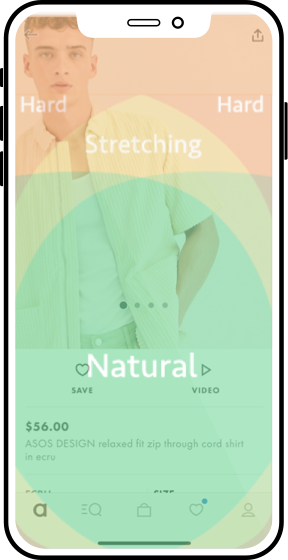
Stretching it...
In the current App, key navigational elements such as 'back', 'done' and 'close' buttons were placed at a hard stretch for the thumb making browsing feel cumbersome.
ASOS is one of the largest and well established online fashion retailers, selling over 850 different brands and shipping to 196 countries
The challenge for this case study was to increase conversion on the App's product page and the wider flow by extension. I defined conversion not only as "add to cart" but rather end-to-end purchase and bundle purchase.
Before running any qualitative user labs with participants, a few immediate usability issues were evident on ASOS' product page.
These issues hindered conversion by making information difficult to find, making the general browsing experience a tedious back and forth exercise while also obscuring the most important call to actions.
In the current App, key navigational elements such as 'back', 'done' and 'close' buttons were placed at a hard stretch for the thumb making browsing feel cumbersome.
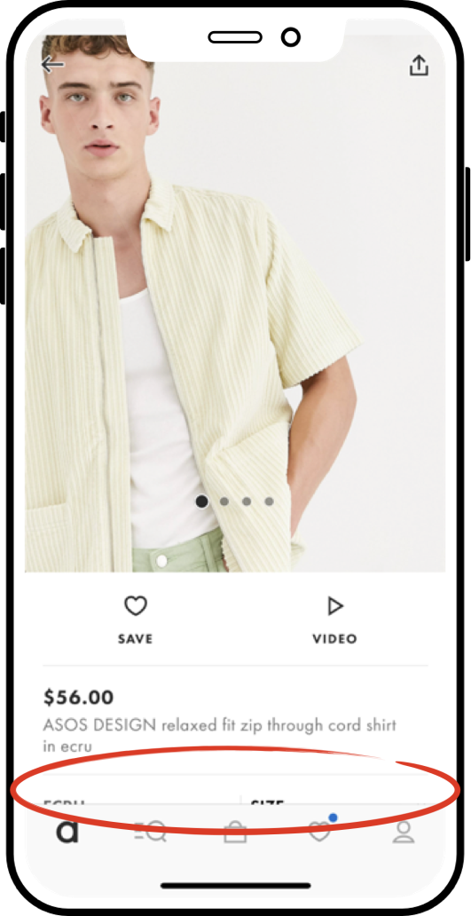
The most important action on the page 'Add to bag' was not immediately visible and required users to scroll.
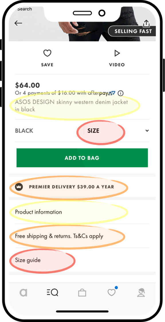
There was many pieces of redundant or duplication information shoe-horned into unexpected areas. For example: 'Premier Delivery' and 'shipping t&c's' were in different areas. 'Size guide' was also nowhere near the size selector.
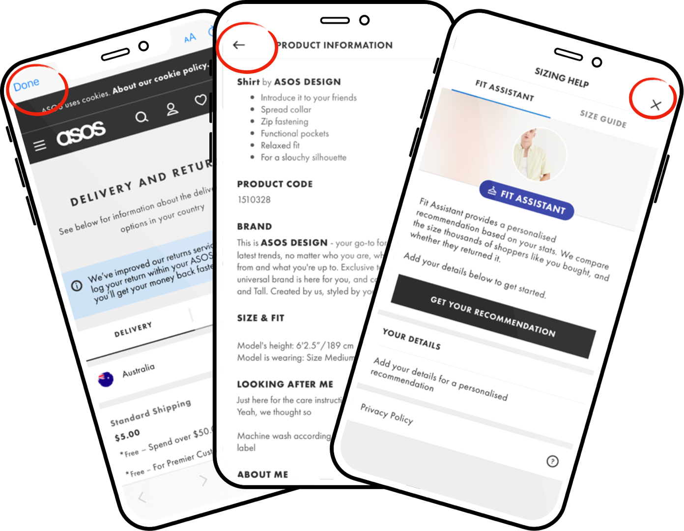
From the product page, many other information was buried in sub pages that pop-up, interrupting the browsing flow and making users dig for information that should have been presented clearly. All of these pages had varying styles of navigation (back, done and close buttons), lacking consistency and making it difficult to return to the previous product page from these navigational dead-ends.
Using the above test script, I recruited participants to do some qualitative testing on the current app.
I made it clear that I wasn't judging their sense of style! I wanted to observe the pain points of the wider purchase flow, not only to optimise the product page's 'add to bag' but also observe how well the current app achieved the the wider conversion goals of purchase and bundle purchase. Below are the pain points I isolated.
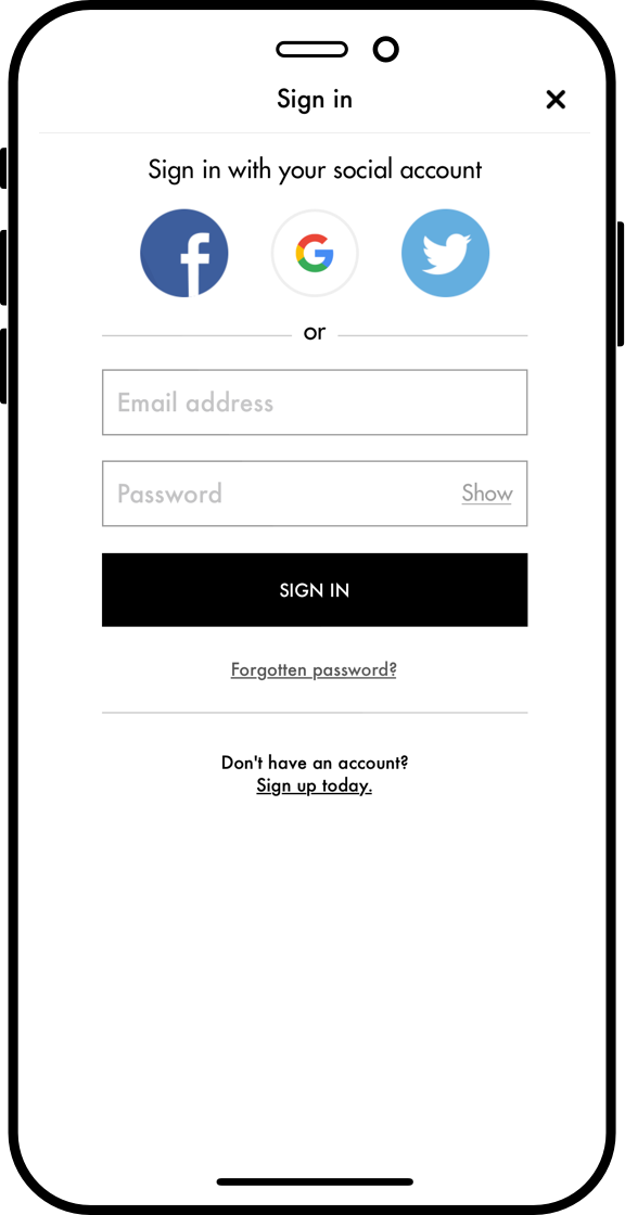
Participants despised the sign in. Sign in hijacked participants train of thought, interrupting the 'add to cart' decision, preventing them from further browsing and bundling items.
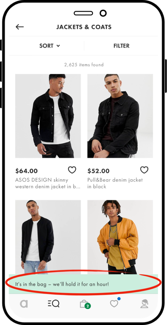
After adding products to the bag, it was not immediately clear to half the participants where 'the bag' was. This was largely due to the message being visually obscured by the user's thumb.
Many tapped on the 'saved' or 'account' sections which also had notification badges
All of these changes were made to a final high fidelity Flinto prototype, that looks and functions better than the real thing.
This case study was not done for a client project, but rather as a challenge. Would love to know how you feel I did.
Like what you see? Reach out and connect with me on LinkedIn