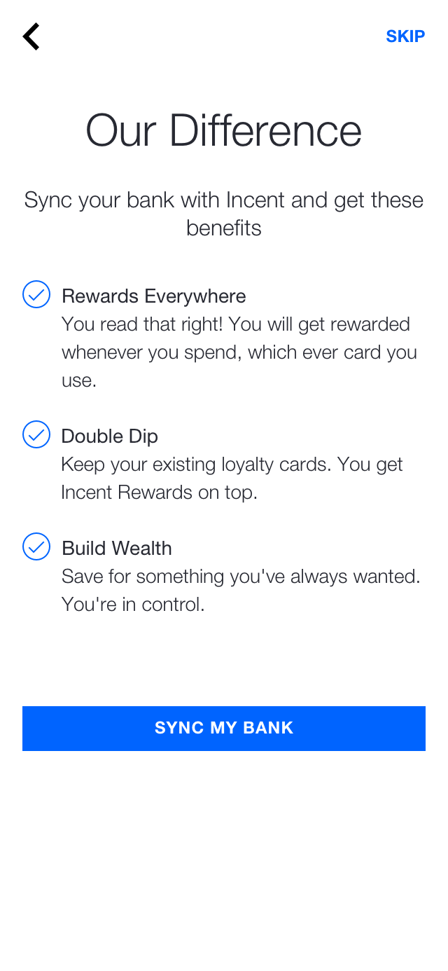
Optimising the Onboarding Funnel


How awesome would it be to get rewarded whenever and wherever you spend in crypto?

That was the premise behind Incent's Insync technology.

A slow uptake in the tech, lead to an ambitious goal of increasing conversion though the onboarding journey.


Key Tools

Key Skills

Funnel Optimising
Data Driven Design
Prototyping
Quantatative Data
Qualatative User Lab
Heat Maps

Challenges


To increase conversion, the entire onboarding flow would need to be scrutinised- from its screen order, language, interactions and even presentation.

Fundamentally the onboarding had to build both worth and trust with users.

Flow and Language


Avg. drop-off per page
Unnecessary steps
Avg. engagement time per page

Hotjar showed users skimmed these text-heavy pages and unnecessary steps, some dropping off altogether. They were a wasted opportunity to brief users on the benefits and syncing process steps. These screens were full of information the business wanted users to know, when all the user needed to know was:

"What in it for me?"


Solutions

  • Remove unnecessary steps
  • Cut down on copy per page
  • Don't talk at customers, talk to them
  • Incorporate concise messaging into 'How it works' structure
Avg. drop-off per page
Avg. Page Revisit
Avg. engagement time per page

By replacing these pages with a simple relatable 'how it works' format - users engagement increased on each page. Not only did the average drop-off per page decrease by over 10% but the slide animation meant many users revisited screens to re-read the benefits.

Bank Search


Drop-off on this page!
Of users skipped Page
Of users closed the page altogether

The staggering drop-off showed a lack of understanding in Insync, with a third of participants stating they didn't understand why they should sync their bank. This was due to a lack of communication on the prior screens.

The remaining partipants gave up due to the perceived latency. When the page loaded, the search field was auto-focused, bringing up a keyboard which obscured the bank list.

As a result, users instinctively began typing, which would initiate an excessively long search process. Participants gave up because they didn't understand what was happening and felt as though the system was 'broken'.


Solutions

  • Remove auto-focus from search field
  • Improve the loading state
  • Cache banks to reduce search latency
  • Improve return state of a 'cancelled' search
Drop-off (reduced 10x!)
Users found their bank without searching
Participants progressed past screen unassisted

By removing the auto-focus from the search field it immediately course-corrected users to instinctively tap on their bank and progress to the next step. This bypassed the latency issue associated with search.

To improve search itself, banks were cached which drastically reduced load times. Informative text was retained during search to give users something to direct their attention to instead of an empty page.

In addition, the cancel search function was improved to return users to a list of popular banks without the need to reload the page.

Trust & Perception


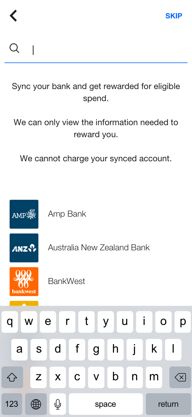
Initially bank syncing was branded to look like part of Incent. This created a user perception and trust issue. While all bank credential information was encrypted and sent directly to the bank, at least 70% of participants who ran through the pilot in our user labs said they felt uneasy about entering their bank credentials into a third party system (Incent).

Initially, we tried to allay these fears with a page on security with multiple notes on how we kept the user safe. However, despite the best of intentions, this page was actually detrimental raising more concerns than putting them to rest. Hotjar, showed the average user paused on this screen for about 40 seconds, with 11% of of participants dropping off. 72% of users then dropped off on the following bank credential entry screen, almost immediately.

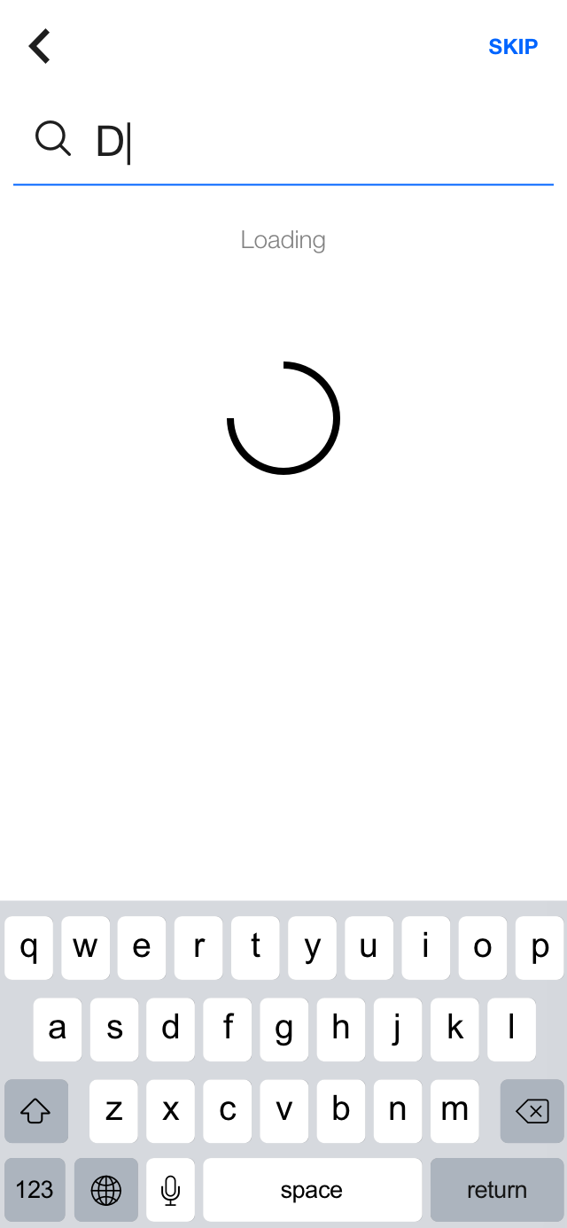
For users that did choose to enter their credentials, the issue was further exacerbated by a long syncing time frame the user would have to sit through, adding to the sense of uncertainty with 30% dropping off during the syncing screen.


Solutions

  • Remove tech jargon from Security page and make it concise
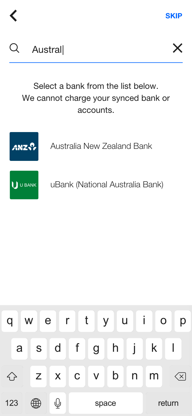
  • Use pop-up animation for the bank credentials entry screen
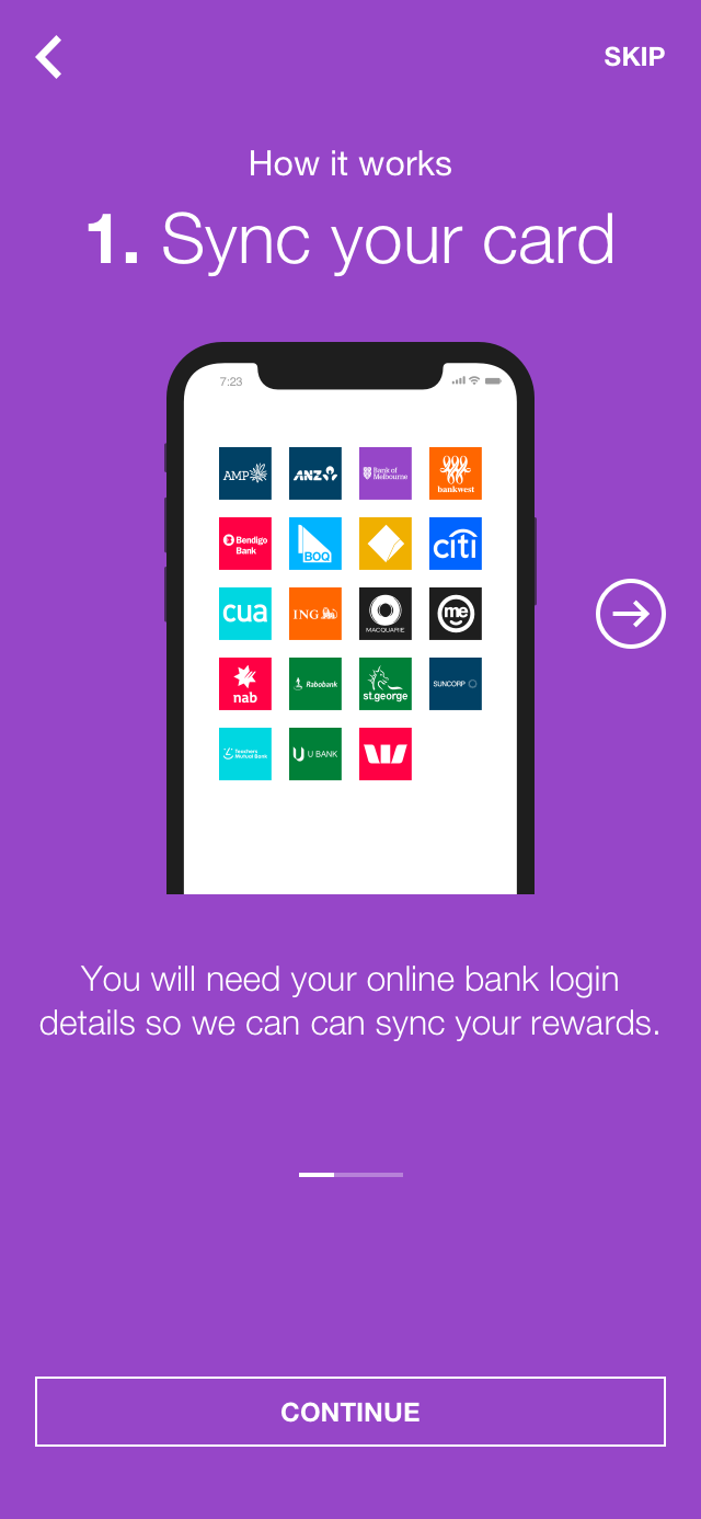
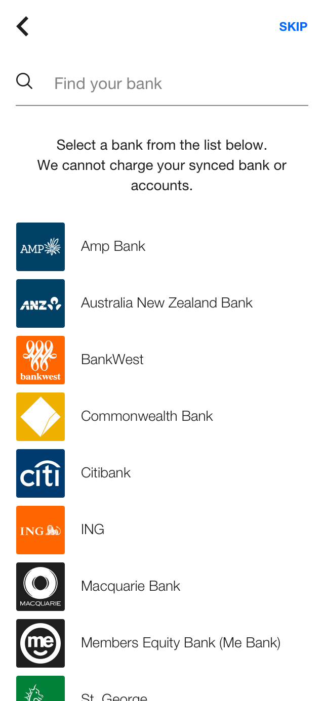
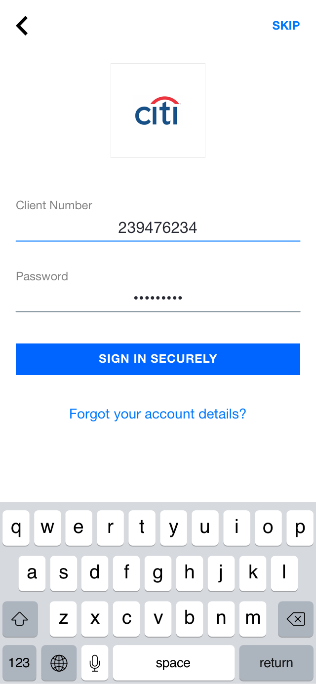
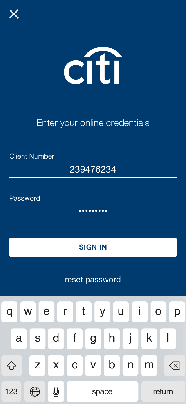
  • Bank credential screen was themed to mirror Bank’s brand identity
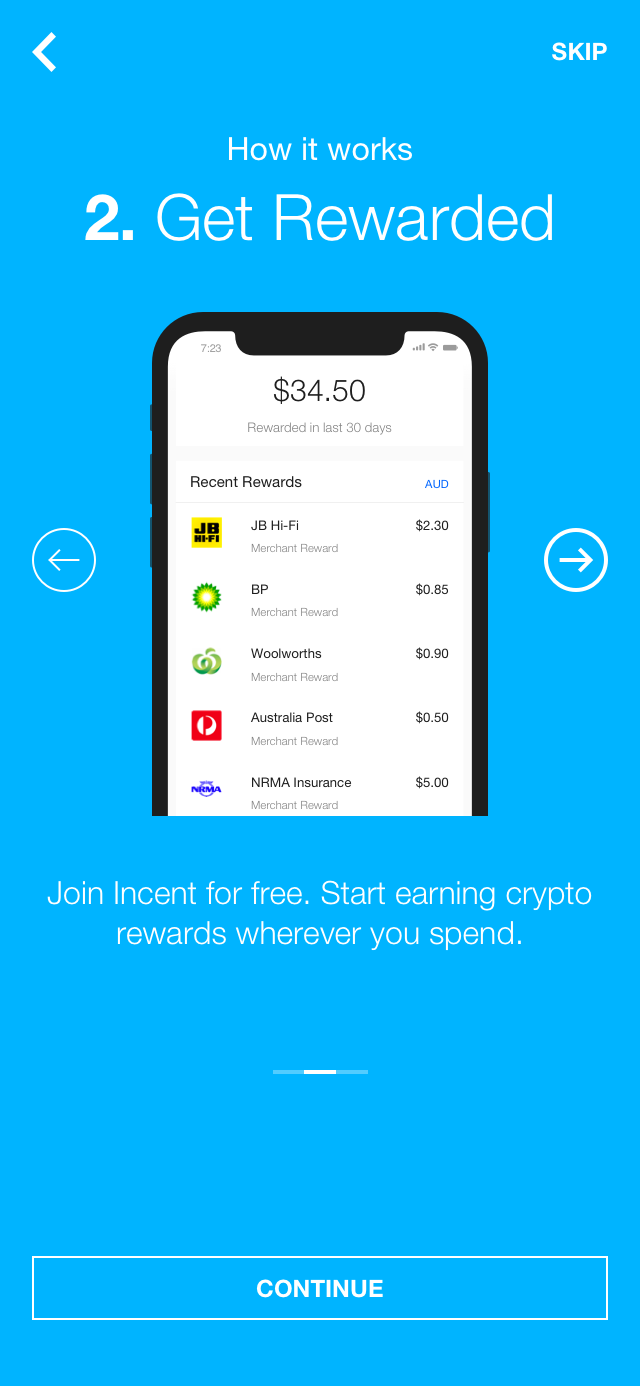
  • Bank syncing process transformed into a background task

By altering the security page, the average time spent on this page dropped from 12 seconds down to 4 seconds. Furthermore, dropoff on this page decreased from 20% down to 11%.

By adding a pop-up style animation and creating pages that mimicked the Bank's own login page, it helped build the perception that this was a bank portal 'popping-up'. Dropoff decreased from 42% to 35%.

Moving the syncing process into the background meant that users would not have to wait for Insync to complete before beginning to use the Incent platform. This reduced the perceived wait time from 5-10minutes (an exceptionally long time for a user to sit on one screen) down to just 1-2 minutes. This reduced drop-off from 72% on this loading screen down to 28%.

Furthermore, instead of the user completing the process frustrated and skipping the end tour, it was found that users spent longer on the end tour (while Insync continued to sync in the background).

Result


Conversion of our onboarding funnel was 5x higher! from 4.7% to 28% (measured through hotjar).

92% of participants in our user lab were able to sync their bank without any assistance.

Insync remains just one way a user can be rewarded by the Incent Platform.